CSS Filters
- applied in order provided
- you can use filter functions or url to svg filters
.element {
  filter: blur(1px);
  filter: url(#blur);
  filter: url(commonfilters.xml#blur);
}
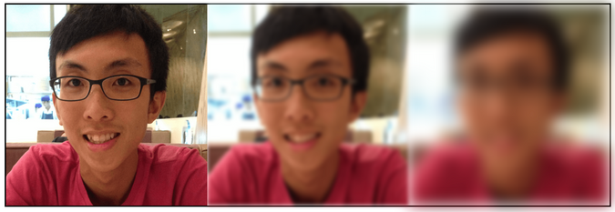
blur()
- uses gaussian blur
- specify blur radius
.center {
  filter: blur(3px);
}
.right {
  filter: blur(10px);
}
brightness()
- takes in percentage value
- greater than 100% - lightening
- less than 100% - darkening
- 0 - complete black
.left {
  filter: brightness(0.5)
}
.right {
  filter: brightness(1.5)
}
contrast()
- takes in percentage value
- greater than 100% - increasing contrast
- less than 100% - decreasing contrast
.left {
  filter: contrast(0.5)
}
.right {
  filter: contrast(1.5)
}
grayscale()
- grayscale vs desaturation
- grayscale: perceptual information of the color will be maintained
invert()
- inverts the dark and light
invert(1)is the default, which completely invertsinvert(0.5)will end up a 50% color gray (light increase and dark decrease at the same amount and meet at 50%)- can be used to implement dark mode (invert everything, then invert the image again)
opacity()
- similar to opacity property
saturate()
- takes in percentage value
- greater than 100% - increasing saturation
- less than 100% - decreasing saturation
sepia()
- sepia has a warm, yellow/brown appearance
- takes in percentage value
- value from 0% - 100%, 100% is complete sepia, 0% is no effect
hue-rotate()
- rotates the color along the color wheel
- takes in an angle
drop-shadow()
- works on the painted space instead of the box
- not casting shadow if it is transparent
url()
- point to svg filter
- svg must be inline, cannot be a url as an image, so that it can be referenced
<style>
  .element {
    filter: url(#my-filter)
  }
</style>

<svg>
  <filter id="my-filter">
     <feGaussianBlur in="SourceGraphic" stdDeviation="5" />
  </filter>
</svg>
backdrop-filter
- apply behind the element, instead on the element
- https://css-tricks.com/almanac/properties/b/backdrop-filter/
SVG Filters
Color Matrix
- https://alistapart.com/article/finessing-fecolormatrix/
- https://css-tricks.com/color-filters-can-turn-your-gray-skies-blue/
- feMerge
svg filter effects fe color matrix
- 4x4 matrix [1000,0100,0010,0001]
- a
svg filter
feBlend
- just like how blend mode works feComponentTransfer
feComposite pixel level image interactions, how each pixels composite together
feConvolve how pixels interacte with its neighbour, this results in blurring, sharpening
feDiffuseLighting defines a light source
feDisplacementMap displaces an image, in, using another image in2 to displace the in image
feFlood fills the filter subregion with the specified color and opacity
feGaussianBlur
same as what blur() use
feImage to use with other filters, feBlend or feComposite
feMerge asynchronous operations in the filter effects instead of layering them
feMorphology erods or dilates the input image
feOffset useful for creating dropShadow
feSpecularLighting use alpha channel as bump map
feTile how image repeated to fill the space
feTurbulence creates image using Perlin turbulence function
https://www.w3.org/TR/filter-effects-1/#ShorthandEquivalents
- https://tympanus.net/codrops/2019/01/15/svg-filters-101
- https://www.sarasoueidan.com/blog/compositing-and-blending-in-css/
- https://alistapart.com/article/finessing-fecolormatrix/
- https://css-tricks.com/color-filters-can-turn-your-gray-skies-blue/
- https://css-tricks.com/look-svg-light-source-filters/