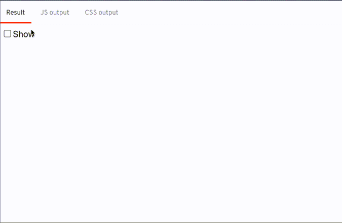
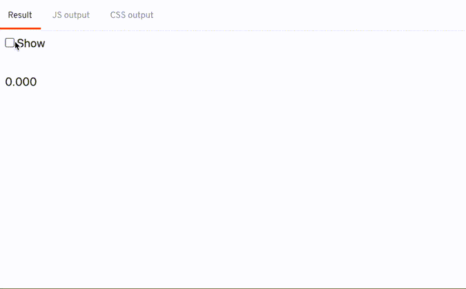
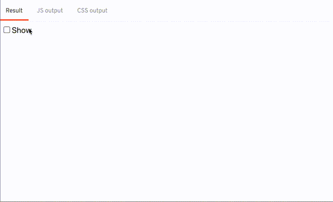
The Result

Break it down slowly

The transition can be broken down into 2 halves:
- 1️⃣ a solid color growing from the left covering the whole text area
- 2️⃣ as the solid color shrinks, it reveals the text
1. The first thing is to figure out the color of the text
function swipeColor(node, params) {
  const { color } = window.getComputedStyle(node);
}
2. I tried using linear-gradient to draw the background
- I use the value of
tto determine how wide the solid color should be
css(t) {
  if (t > 0.5) {
    // transform t from range [0.5, 1] into percentage [0, 100]
    // t: 0.5 -> 1
    // u: 0 -> 0.5
    const u = t - 0.5;
    // percentage: 0 -> 100
    const percentage = u * 200;
    return `background: linear-gradient(to right, transparent 0, ${percentage}%, ${color} ${percentage}%);`;
  } else {
    // transform t from range [0, 0.5] into percentage [0, 100]
    // t: 0 -> 0.5
    // percentage: 0 -> 100
    const percentage = t * 200;
    return `background: linear-gradient(to right, ${color} 0, ${percentage}%, transparent ${percentage}%);`;
  }
},
3. Next I need to hide / reveal the text at the right time
- I hid the text by setting the text color to transparent
css(t) {
  if (t > 0.5) {
    return `color: ${color}`;
  } else {
    return `color: transparent`;
  }
}
4. Combining the both 2. and 3. together
css(t) {
  if (t > 0.5) {
    // transform t from range [0.5, 1] into percentage [0, 100]
    // t: 0.5 -> 1
    // u: 0 -> 0.5
    const u = t - 0.5;
    // percentage: 0 -> 100
    const percentage = u * 200;
    return `
      background: linear-gradient(to right, transparent 0, ${percentage}%, ${color} ${percentage}%);
      color: ${color};
    `;
  } else {
    // transform t from range [0, 0.5] into percentage [0, 100]
    // t: 0 -> 0.5
    // percentage: 0 -> 100
    const percentage = t * 200;
    return `
      background: linear-gradient(to right, ${color} 0, ${percentage}%, transparent ${percentage}%);
      color: transparent;
    `;
  }
},
5. final touches, pass the duration, delay, and easing into the returned object
<script> function swipeColor(node, params) { const { duration, delay, easing } = params || {}; return { duration, delay, easing, css(t) { /* ... */ }, }; }</script>{#if show} <span transition:swipeColor>Hello world</span> <span transition:swipeColor={{ delay: 300 }}>Hello world</span>{/if}Final code
function swipeColor(node, params) {
  const { duration, delay, easing } = params || {};
  const { color } = window.getComputedStyle(node);
  return {
    duration,
    delay,
    easing,
    css(t) {
      if (t > 0.5) {
        // transform t from range [0.5, 1] into percentage [0, 100]
        // t: 0.5 -> 1
        // u: 0 -> 0.5
        const u = t - 0.5;
        // percentage: 0 -> 100
        const percentage = u * 200;
        return `
          background: linear-gradient(to right, transparent 0, ${percentage}%, ${color} ${percentage}%);
          color: ${color};
        `;
      } else {
        // transform t from range [0, 0.5] into percentage [0, 100]
        // t: 0 -> 0.5
        // percentage: 0 -> 100
        const percentage = t * 200;
        return `
          background: linear-gradient(to right, ${color} 0, ${percentage}%, transparent ${percentage}%);
          color: transparent;
        `;
      }
    },
  };
}
Extra
Svelte has make writing custom transitions simple, with the code above, the transition itself is able to pause / reverse halfway through the transition
